Docs
Customizing Themes in Trilium
Default Themes
Trilium comes with a couple pre-installed color themes, with the default being a light theme. To switch to a dark theme or any other available theme, navigate to the Options menu (accessible via the app icon in the top-left corner), select the Appearance tab, and choose your preferred theme.
Creating Custom CSS Themes
Trilium supports custom user themes, allowing you to personalize the application’s appearance. To create a custom theme, follow these steps:
- Create a CSS Code Note: Start by creating a new code note with the
CSStype. - Annotate with
#appTheme: Add the attribute#appTheme=my-theme-nameto your note, wheremy-theme-nameis the name of your custom theme. - Define Your Styles: Write your custom CSS within the note. Below is an example of a custom theme:
@font-face {
  font-family: 'Raleway';
  font-style: normal;
  font-weight: 400;
  src: url('/custom/fonts/raleway.woff2') format('woff2');
}

:root {
    --main-font-family: 'Raleway' !important;
    --main-font-size: normal;
    --tree-font-family: inherit;
    --tree-font-size: normal;
    --detail-font-family: inherit;
    --detail-font-size: normal;
    --detail-text-font-family: 'Garamond' !important;

    --main-background-color: #404552;
    --main-text-color: #AFB8C6;
    --main-border-color: #AFB8C6;
    --accented-background-color: #383C4A;
    --more-accented-background-color: #2F343F;
    --header-background-color: #383C4A;
    --button-background-color: #2F343F;
    --button-disabled-background-color: #404552;
    --button-border-color: #333;
    --button-text-color: #AFB8C6;
    --button-border-radius: 2px;
    --primary-button-background-color: #6c757d;
    --primary-button-text-color: white;
    --primary-button-border-color: #6c757d;
    --muted-text-color: #86919F;
    --input-text-color: #AFB8C6;
    --input-background-color: #404552;
    --hover-item-text-color: white;
    --hover-item-background-color: #4877B1;
    --active-item-text-color: white;
    --active-item-background-color: #4877B1;
    --menu-text-color: #AFB8C6;
    --menu-background-color: #383C4A;
    --tooltip-background-color: #383C4A;
    --link-color: lightskyblue;
    --modal-background-color: #404552;
    --modal-backdrop-color: black;
    --scrollbar-border-color: rgba(175, 184, 198, 0.5);
}

body .note-detail-text {
    font-size: 120%;
}

body .CodeMirror {
    filter: invert(100%) hue-rotate(180deg);
}
Activating Your Custom Theme
Once you’ve created your custom theme:
- Go to “Menu” -> “Options” -> “Appearance.”
- In the theme selection dropdown, you should see your custom theme listed under the name you provided with the
#appThemelabel. - Select your custom theme to activate it.
If you make changes to your theme, press CTRL-R to reload the frontend and apply your updates.
Sharing and Importing Themes
Custom themes can be exported as .tar archives, which can be shared with other users. However, be cautious when importing themes from untrusted sources, as they may contain executable scripts that could pose security risks.
An example user theme, Steel Blue, is available in the demo document.
Using Custom CSS for Specific Purposes
In addition to full themes, Trilium allows for custom CSS that isn’t tied to a theme. This can be particularly useful in scripting contexts, where you might want to modify specific UI elements, such as changing the colors of notes in the tree view.
Applying Custom CSS
To use custom CSS:
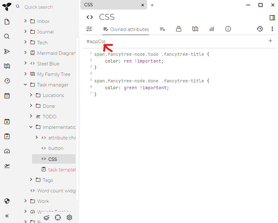
- Create a CSS Code Note: Create a new code note with the
CSStype. - Add the
appCssLabel: Annotate the note with the#appCsslabel. - Write Your CSS: Add your custom CSS rules to the note.
For example:
/* Custom CSS to style specific elements */
.tree-item {
    color: #ff6347; /* Change tree item color */
}
When Trilium’s frontend starts, all notes labeled with appCss are automatically included in the style element of the HTML page.
After making changes, press CTRL-R to reload the frontend and apply your new styles.
Styling Specific Notes in the Tree
To apply specific styles to certain notes in the tree:
- Use the
cssClassAttribute: Add thecssClassattribute to a note, and assign it a value representing the desired CSS class. - Define an
iconClass: You can also define a custom icon for a note using theiconClassattribute, selecting from Box Icons or your own custom classes.
For example, if you want to style notes of a specific type, such as notes containing PNG images, you can target them with classes like type-image mime-image-png.
User-Provided Themes
A gallery of user-created themes is available, showcasing the variety of customizations that the Trilium community has developed. For more information, visit the Theme Gallery.
Asset Path Management
When referencing built-in assets like images in your custom themes or CSS, you can avoid hardcoding version numbers by using the vX alias. For example, instead of specifying /assets/v0.57.0-beta/images/icon-grey.png, you can use /assets/vX/images/icon-grey.png to keep your theme compatible with future versions of Trilium.